Monday, 23 November 2009

Creating My Own Typeface

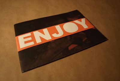
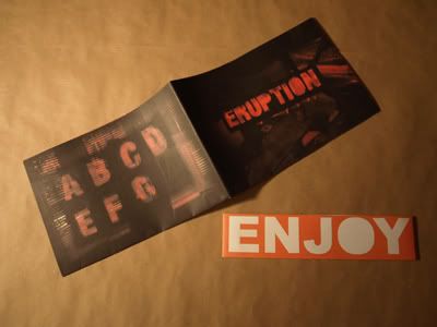
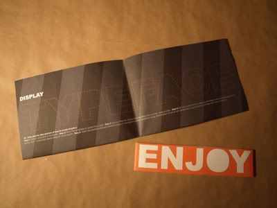
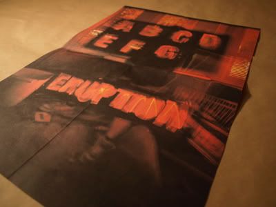
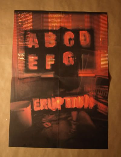
I was given the brief to create my own typeface and provide a Mailer that would be sent to people to advertise it. This is the mailer an shows a Sample of letters and the title 'Eruption' is made from the typeface.

blog 5

blog 1

blog 2

blog 3

blog 4

Billboards

I was asked to create four billboard designs to encourage people to talk about Energy

blog 11

blog 10

blog 9

blog 8

blog 7

blog 6

Prozone Paintball

This Company came to me wanting a new set promotionl items (poster, flyer, vouchers), and a new letterhead. This place is great days paintball with great prices, well worth the visit. Check them out for yourself: http://www.prozone.org.uk/


Poster
Flyer: front
Flyer: back
Voucher: back
Voucher: Free paintVoucher: Birthday

Larch Cottage

The brief was to design a Logo and Indentity which would encase all 3 sections, Nurseries, Gallery, Restaurant. The ideal behing the colour scheme is, summer, autumn, and winter. to show a progression, as the majority of people who visit, browse the plants then the gallery, and finally ending the day with a nice warm meal.


Thursday, 3 September 2009

Grow your own

We were asked to design a sollution for Homebase's Grow your own, as they wanted to re-launch the product, my attempt...


Monday, 8 December 2008

Back cover


Not having a back cover before tommorow was getting to me, so here we are at 02.43 with a back cover. job done

Front cover for map


Saturday, 6 December 2008

Working progress


The main instert to a fold out booklet im designing as a direct mail alternative to the event poster bellow, feel free to post feedback.

Friday, 5 December 2008

Event Poster


think i might use this as my final, depends on the feedback though, post ur opinions.
(with improved grammer)

Monday, 17 November 2008

The Whole corporate idenity

Some photographs of the final piece. As a whole i am happy with the end result although certain things do need re working, but at the end of the day we learn from our mistakes, that's life.

The back of each item was gray and had a target printed on it like the one shown bellow.. this helped to carry both the theme and the playful nature of the company whilst still looking professional on the front.

The folder for the guidelines, within this there was the guidelines and a sample of each item, the letterhead, compliments slip, and business card.
Cut out the type and backed it with a metal mesh, to add a bit of excitement to the cover

Please feel free to comment good or bad, as they will help me in my path to graphic enlightenment.


Thursday, 6 November 2008

Logo Idea

This is a logo im working on for a corporate identity I'm doing at the moment, mobile outdoor pursuit cabins.

Soviet Asparagus

This sexy little number was from a project we did last year, advertising fruit'n'veg so i took the asparagus on a little Communist campaign trail, was fun.

Editorial brief

We were asked to design a front cover, contents splash and turn.. the urn needs re-designing so heres the first three.